


All important decisions about your child’s education – eligibility, special education, and related services in your child’s IEP, educational progress, compensatory education (or “recovery services”) – are based on test scores. Not grades, not subjective observations – test scores.
As your child returns to school, struggles to get into a routine, you need to know what happened to your child’s learning and progress/lack of progress during the year, plus when the school was closed and did not provide live, face-to-face education. This valuable information is in your child’s test scores. Did your child progress? Did your child lose skills or regress during the COVID school closures? To successfully negotiate for special ed services to make up for the lost skills and regression, you need to understand test scores.
To write accurate Present Levels of Academic Achievement and Functional Performance, you need baseline data from objective tests.
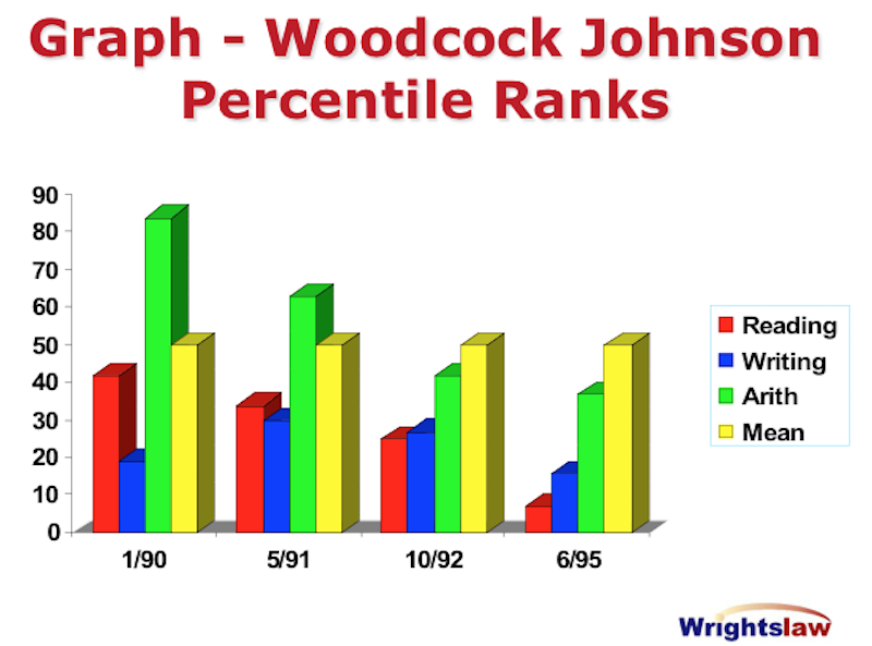
At a training many years ago, I heard that if a parent requested evaluation data be graphed, the school needed to provide the graphed data. A graph of data is much easier to interpret than a written narrative. Are schools required to graph data for parents?
There is no legal requirement that schools must graph evaluation data if requested by the parents.
Parents should master this skill themselves.
Suppose your child has received special education for three years.
- Has your child caught up with the peer group?
- Has your child fallen further behind?
- How do you know?…
- What do standard scores, percentile ranks, subtest scores, and age and grade equivalents mean?
In Wrightslaw training programs, I show parents how to use test scores to create Progress /Regression charts and graphs. In the old pre-computer days, we used graph paper and colored pencils to make Progress Graphs. Now we use MS Word, Excel, or PowerPoint to make these Progress / Regression graphs.
After attending a Wrightslaw training program in MA, LC writes –
“Using your advice, my daughter is now going to receive more services than we even requested. The school principal and I are back on laughing terms. I have also been able to help friends with problems they were having.”
“And I gave the principal a lesson on the bell curve. She feels that the way I have been taught is much easier to understand. I will always be forever grateful for the great training you both provided.”
 Because this is such an important skill, the Wrightslaw Team developed Understanding Your Child’s Test Scores, a training program about test scores.
https://www.wrightslaw.com/webex/test.scores.index.htm
In this 1.5 hour program, you learn about the bell curve, mean, and standard deviations. You learn how to draw the bell curve and how to use your child’s test scores to create powerful progress graphs.
I will also teach you about standard scores, percentile ranks, subtest scores, composite or cluster scores, and subtest scatter.
You will find an article on Wrightslaw entitled Tests and Measurements for the Parent, Educator, Advocate & Attorney. This has been the #1 download since 1998: definitely a “must-read.”
https://www.wrightslaw.com/advoc/articles/tests_measurements.html
Time to Review
From a Wrightslaw Short Course – Present Levels in the IEP. What’s So Important?
My confusion comes with the school doing different testing so I have to compare against.
If you are dealing with Dyslexia…They want you to get confused and give up. Don’t let them obfuscate and demoralize you.
I attended the Lansing, MI Wrightslaw conf. last spring and came home to new test scores which I promptly graphed for an upcoming IEP meeting, I had 3 sets of scores done 3 years in a row and each showed a lower percentage from the last according to peer data. The special ed director responded by saying his scores were great, they were not. The school psychologist responded with the 3rd grade scores are compared to one set of peers and the 4th grade to another so it is okay that his scores went down across the board. The graphs were so clear! Made me sick and I wish I had an advocate with me that day. No dyslexia related services have ever been given, no reading specialist in district, no Orton Gillingham tutor, pulling him tomorrow to homeschool because I have no energy to take them to court. Probably exactly what they hope I will do.
No need to learn a hard computer program to create graphs. Go to http://nces.ed.gov/nceskids/createagraph/default.aspx. It’s free, easy and you can print or save on your computer.
My child tested 3 grade levels ahead in math at start of new school year in a new school system. School didn’t do anything despite us telling them she was bored (we didn’t know about their own testing showing 3 grade levels ahead yet). I made graphs from this website based upon private test scores. I e-mailed to the school ahead of IEP meeting. When I got to IEP the LEA jokingly said she needed to hire me. There was no disputing after that and advanced math was put in place.
For simple score conversions, such as standard scores to T-scores, z-scores, or percentiles you can also make use of the free PAR toolkit app available for iOS and Android devices. It is a nice tool for a quick visual of where a score falls on the normal curve.
http://toolkit.parinc.com/
What about the casemis file? Doesn’t that contain a lot of information regarding my child?
Pete – I recently met you at “The Atypical Learners” conference in MD. I came home determined to master the bell curve and remember my Stats 221 class from college. I listened to your program on the computer and it was so easy to follow along! I then charted all of my daughters scores and was astounded. What I thought was okay was not. She was 1-2 standard deviations below the mean in everything!
I e-mailed the principal and told her I met you at a conference and you referred to my daughter’s IEP as “what not to do” in your presentation. She forwarded it to the district and my daughter is now FINALLY getting some of the help she needs. We have another IEP meeting in June with Dr. Samango-Sprouse and her results but graphing made all the difference for me. Test scores that I thought I understood – I didn’t.
Thanks again!
Dad2Luke, I know yoiu must be frustrated. Quick question, after the meeting where you presented your graphs, did you document in your follow up thank you note, that you provided the team with the graphs along with what the grpahs showed according to THEIR own data? I also always attach another copy of my graphs to my followup letter, making sure that my letter shows there are attachments and I number them, so they do not “disappear” from the education records. Just a thought.
The psychologist at our school said that she did not like graphs because they misrepresent the impact. Of course, I suggested that it wasn’t a misrepresentation when half of the bell curve was “average” and our daughter was in the bottom % per a subtest that impacted her writing……It is powerful when you are in a difficult situation.
Help, recently I attended a Wrightslaw conference and was informed that using powerpoint is an effective tool to graph for an IEP meeting. Are the directions on the Wrightslaw web-site?
Debbie:
Directions are here: Understanding Your Child’s Test Scores – https://www.wrightslaw.com/webex/test.scores.index.htm
In this 1.5 hour program, Pete Wright will teach you about the bell curve, mean, and standard deviations. You’ll learn how to draw the bell curve and how to use your child’s test scores to create powerful progress graphs. Pete will also teach you about standard scores, percentile ranks, subtest scores, composite or cluster scores, and subtest scatter.
I have a PhD in the sciences and so graphing data is second nature. It is an act/science to graph the data to clearly tell the story. But with practice it can be done and with computers trying all sorts of things to get that practice is a lot easier.
I also have observed that my District is not interested in clearly telling the story since if they don’t, you have to accept whatever it is they they want to tell you verbally. And I have see disagreements between the verbal reports and the test scores.
My story about graphing was that i made a nice color graph showing regression in my son’s social skills over the last few years. I showed it at a meeting and the SpEd manager took my copy, turned it face down and buried it in her papers. I knew then that I had hit a nerve. The same numbers in tables had had no effect before.
I brought a graph showing my son’s test scores to an eligibility meeting. The entire graph contained data the district had on file and could easily confirm. They asked me who prepared the graph, and when I said that I had, they turned it over and would not discuss or consider it.